
The following identity and brand system for Kotei Kids Shaved Ice, a start up food truck business serving organic flavored shaved ice was created to help you present the brand in a consistent,
recognizable, and proprietary way.

The logo for the business falls under the “wordmark logo” type. Apart from simplicty. wordmark logo offers clear and concise message. The text simply tells the public who you are and typically build a more lasting impression. Some of the Iconic brands use the wordmark logo such as Canon, Fedex, and Cadbury.
The logo is designed using a handwritten script font, modified to have an appeal to all ages. It is arranged in an upward diagonal direction to present an energetic vibes. The Emphasis of the wordmark logo are the words “Kotei Kids” which are designed bigger than the words “Shaved Ice”
The main logo variation uses white as the inner wordmark color. White colors allows the logo to be matched to any color variation. As for the outer lining, there are several variations that can be used for the logo. However for the main variation, we use the cool vibrant color of teal. The color represents the coolness of the product.
Our main goal is not to look like everyone else.
How we use our logo is crucial in keeping its visual meaning and identity intact. While we can alter certain aspects of the logo without losing impact and recognition, these options are limited. The following guidelines should always be your first option.

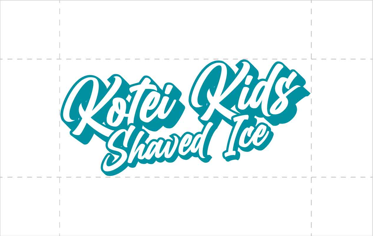
When the logo is used, it should be sufficiently isolated from illustrations or other words or images that might detract from the signature’s importance. The logo must be at least 30% of the logo mark away from illustrations, photographs, rules, page edges, or other type.
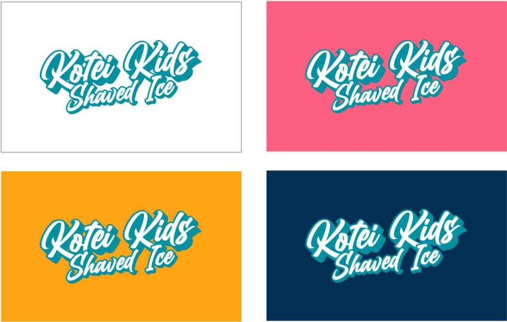
The preferred use of the logo is white/teal on the three main skin colors – Brick (pink), Fire (yellow), Prussian (blue). These applications of the logo should always be considered as the first design options.








Standard color palette must be used using the appropriate color code
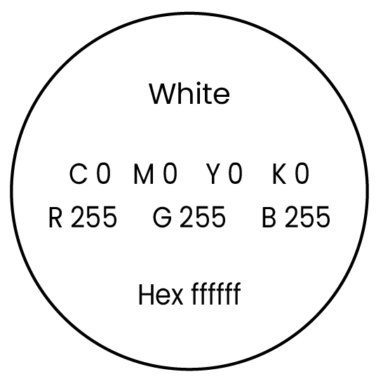
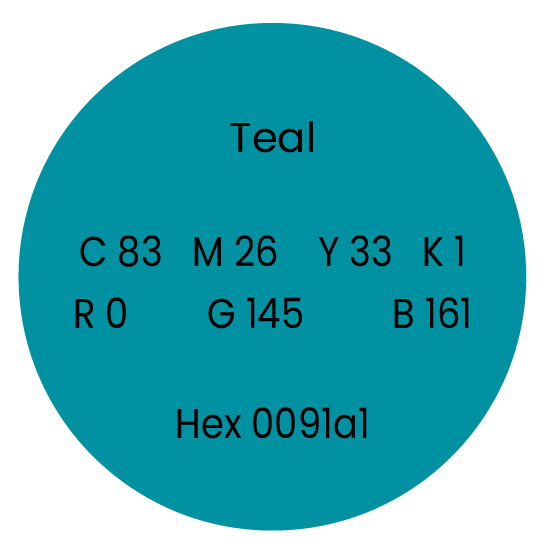
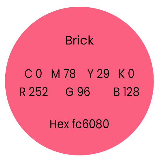
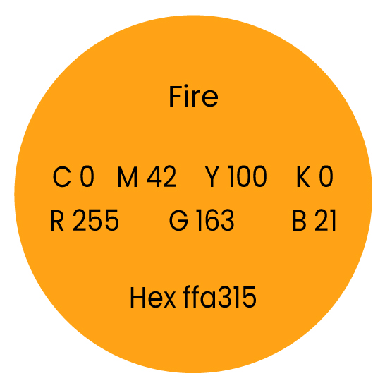
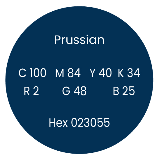
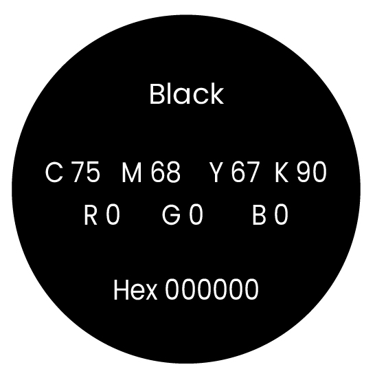
The Logo designed could be flexible and be used on other color combination as we deem appropriate. These color combinations presented are secondary colors that we can use as part of the background


The Font BillionDreams is used for the Logo and could be use as header for designs
The Font Blueberry is used as secondary font. It can be used as design accent and font for titles
The Font Family Poppins is used for all body on contents


